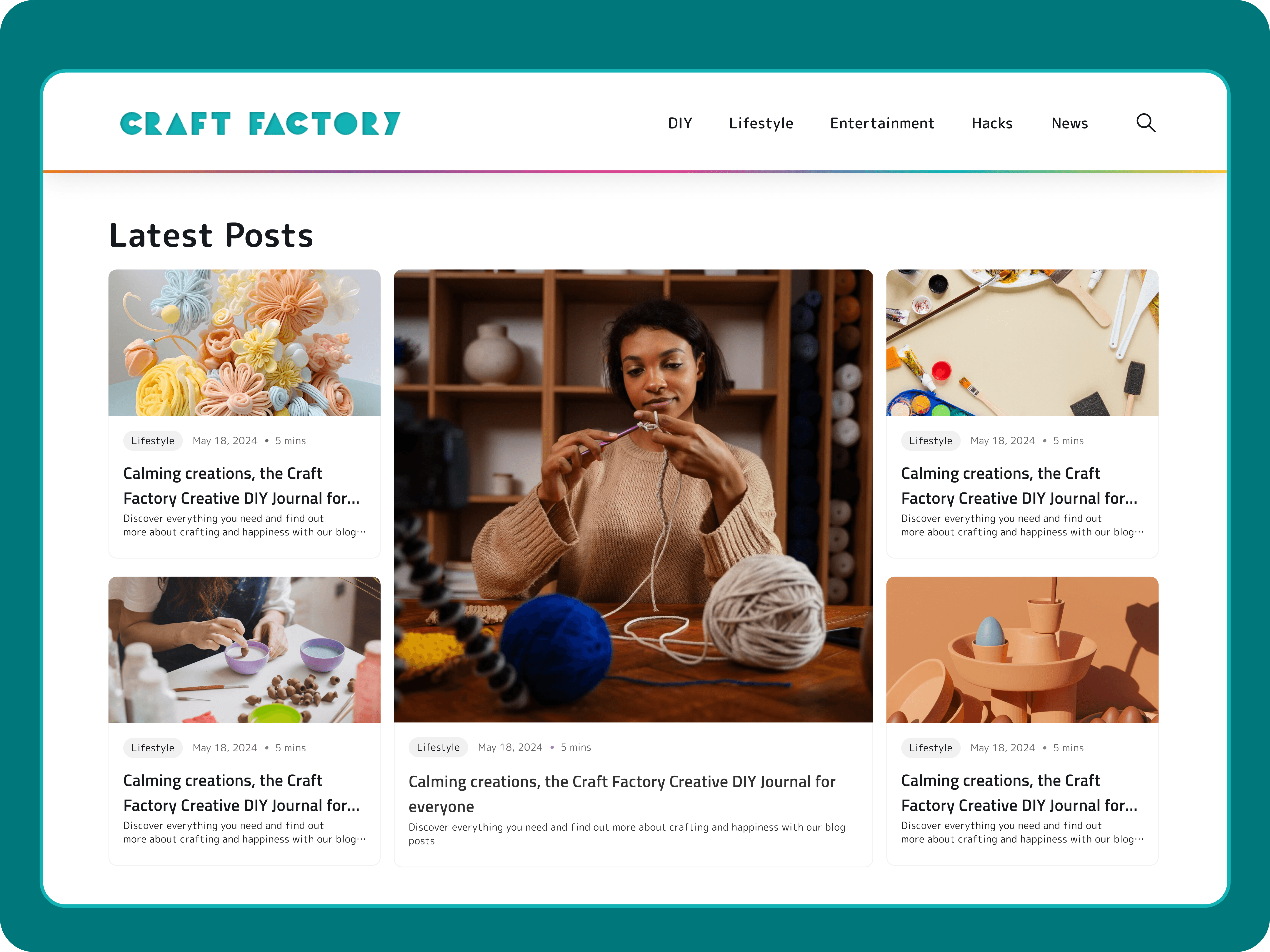
Craft Factory
Craft Factory
Craft Factory
Craft Blog Website Redesign
Project Type: Responsive Website Design
Role: UI design, User research, User Stories, User Flow, Information Architecture, Wireframes(lo-fi &hifi) Visual Design, Usability Testing and Launch
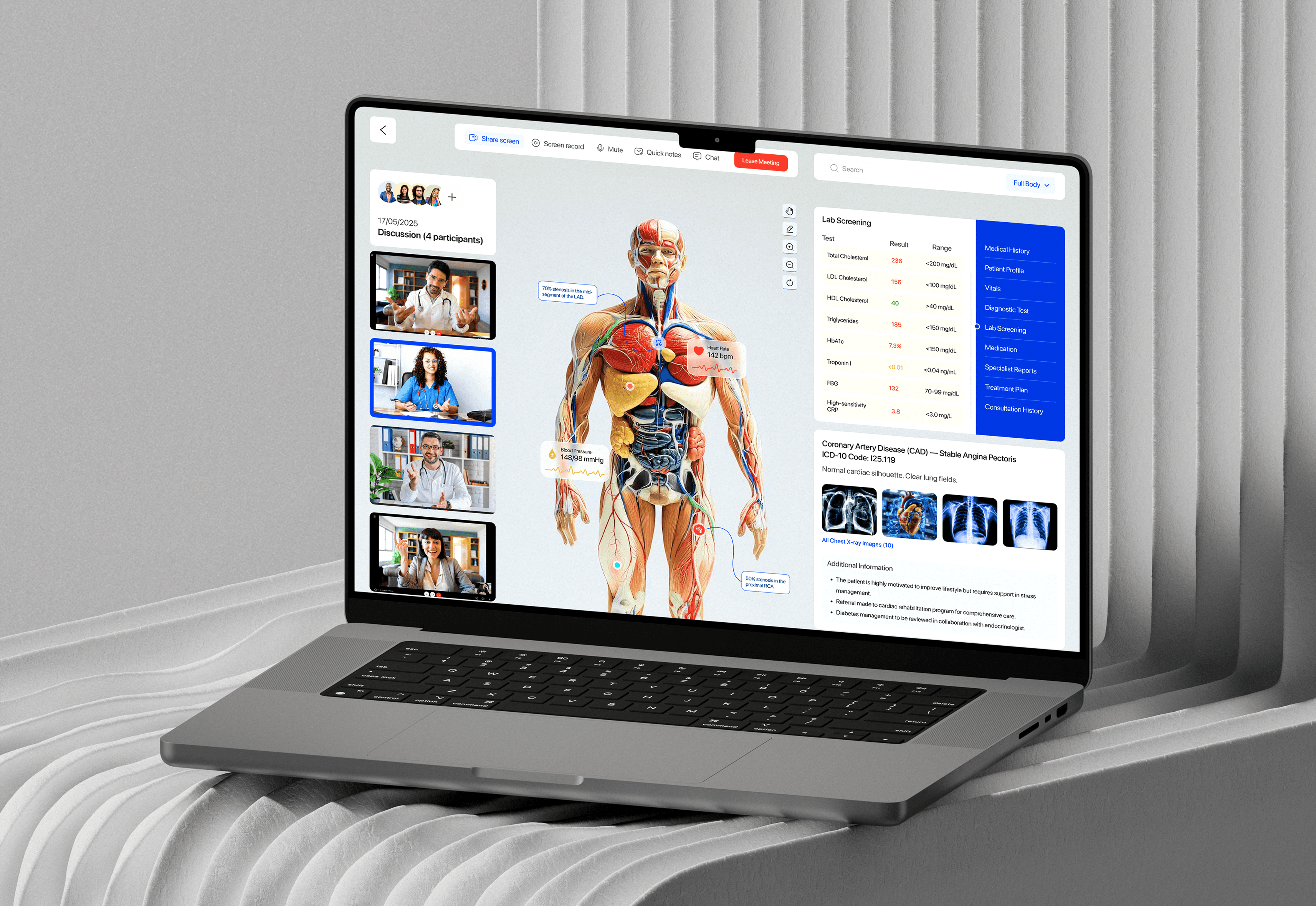
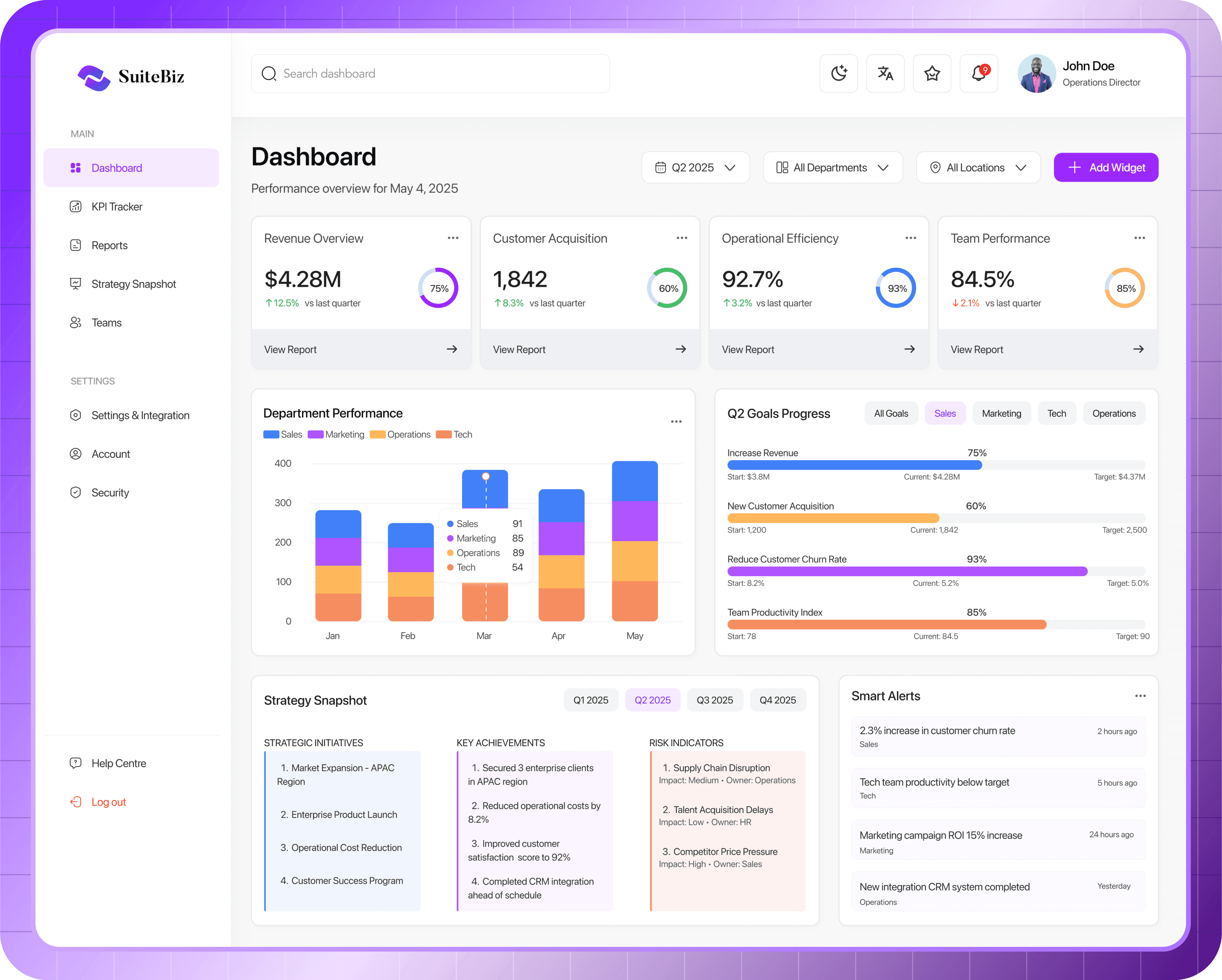
Operations & Performance Dashboard for Companies
Project Type: SAAS B2B Dashboard Platform
Role: Lead Product Designer (UX/UI, Research, Testing, Interaction Design)
Blog / B2C
Blog / B2C
Blog / B2C
Live
Live
Live
2024
2024
2024

Overview
Overview
Craft Factory is a modern, playful DIY and lifestyle blog designed to inspire creativity. Targeting hobbyists, students, and DIY-savvy parents in the UK and Europe, the platform delivers clearly structured craft tutorials, life hacks, entertainment, and home projects. It enable users to explore hands-on projects through step-by-step guides for personal fun, learning, or family bonding.
Craft Factory is a modern, playful DIY and lifestyle blog designed to inspire creativity. Targeting hobbyists, students, and DIY-savvy parents in the UK and Europe, the platform delivers clearly structured craft tutorials, life hacks, entertainment, and home projects. It enable users to explore hands-on projects through step-by-step guides for personal fun, learning, or family bonding.
Why The Redesign
Why The Redesign
The previous blog was visually inconsistent and cluttered, which made it hard for visitors to find what they were looking for. Although the main focus was DIY crafts, the addition of categories like entertainment, lifestyle, hacks, and news without clear organization left the site feeling confusing and overwhelming. The outdated design, lack of accessibility features also drove away younger readers, resulting in high bounce rates and low engagement.
The previous blog was visually inconsistent and cluttered, which made it hard for visitors to find what they were looking for. Although the main focus was DIY crafts, the addition of categories like entertainment, lifestyle, hacks, and news without clear organization left the site feeling confusing and overwhelming. The outdated design, lack of accessibility features also drove away younger readers, resulting in high bounce rates and low engagement.
Redesign Goals: What do we intend to achieve?
Redesign Goals: What do we intend to achieve?
Build trust with tested, clearly documented DIY guides
Provide free, accessible content with a fresh, modern layout
Increase user engagement by 30%
Integrate high-quality, SEO-rich content
Display minimal, non-intrusive ads
Build trust with tested, clearly documented DIY guides
Provide free, accessible content with a fresh, modern layout
Increase user engagement by 30%
Integrate high-quality, SEO-rich content
Display minimal, non-intrusive ads
UX Solution: Why It Works
UX Solution: Why It Works
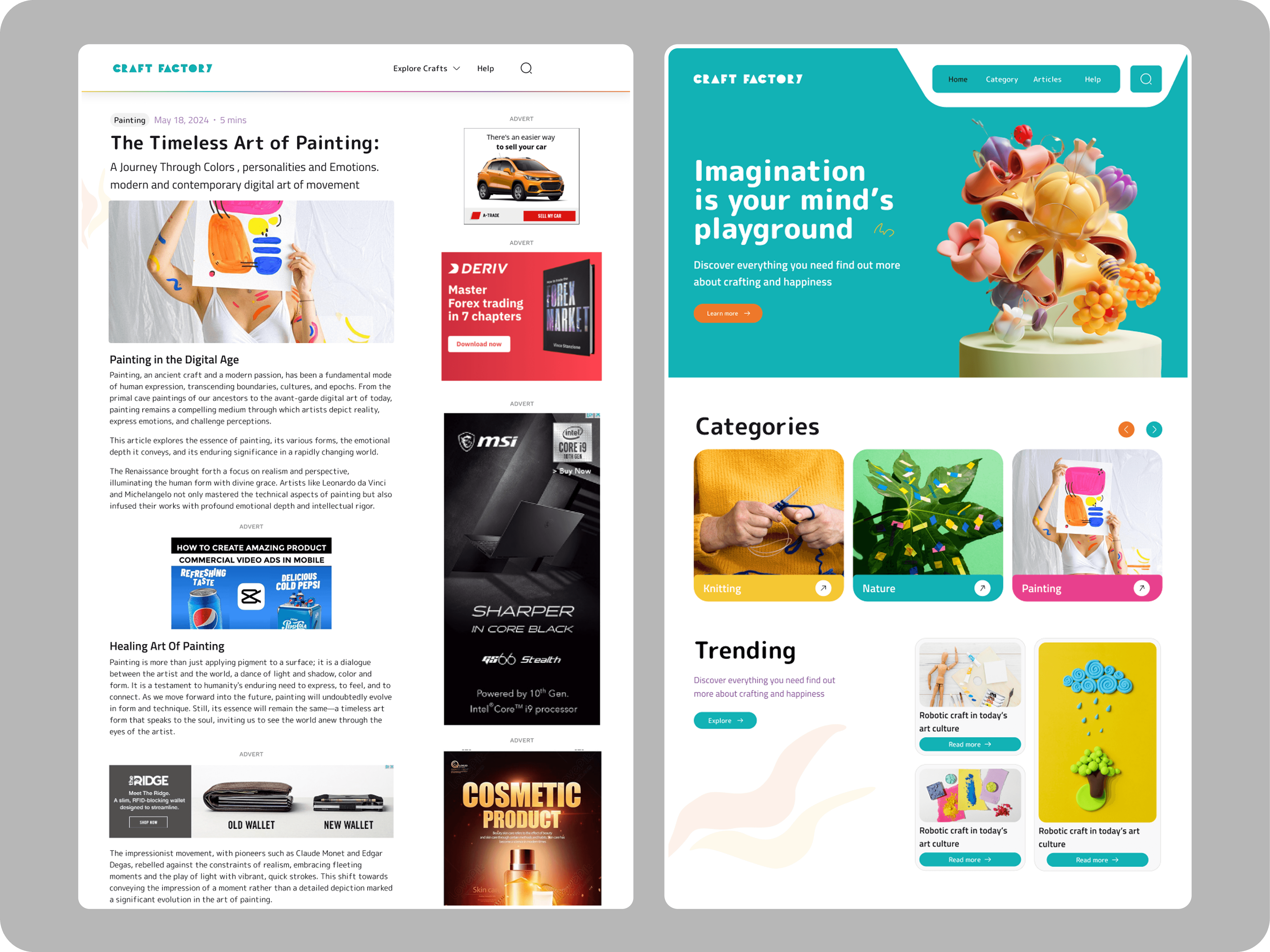
The result was a simple four-page website: a landing page, category page, article page, and terms/privacy policy page. We focused on including only the essentials, making it easy to use and navigate. The goal was to create a design that’s both efficient and delivers real value. We maintained the previous design system and Brand guidelines to allow consistency and accessibility for old users. We mainly focused on these key areas
Layout: Minimalist grid layout with visual category tiles and consistent spacing
Typography: Readable sans-serif fonts with scalable line-height and weight
Accessibility: Alt text, Strong contrast for readability (WCAG 2.1 AA compliant)
Content Structure: Segmented clearly by category with breadcrumbs, filters, and tags
Interactivity: Reaction buttons and "Save for Later" features
My Responsibilities
My Responsibilities
My responsibilities
I worked as the sole designer alongside the team lead, product manager CEO and engineers to strategize and iterate through this process. I was responsible for the UI design, User research, User Stories, User Flow, Information Architecture, Wireframes(lo-fi & hifi) Visual Design, Usability Testing and Launch
I worked as the sole designer alongside the team lead, product manager CEO and engineers to strategize and iterate through this process. I was responsible for the UI design, User research, User Stories, User Flow, Information Architecture, Wireframes(lo-fi & hifi) Visual Design, Usability Testing and Launch
Old Design UI
Old Design UI

New Design UI
New Design UI

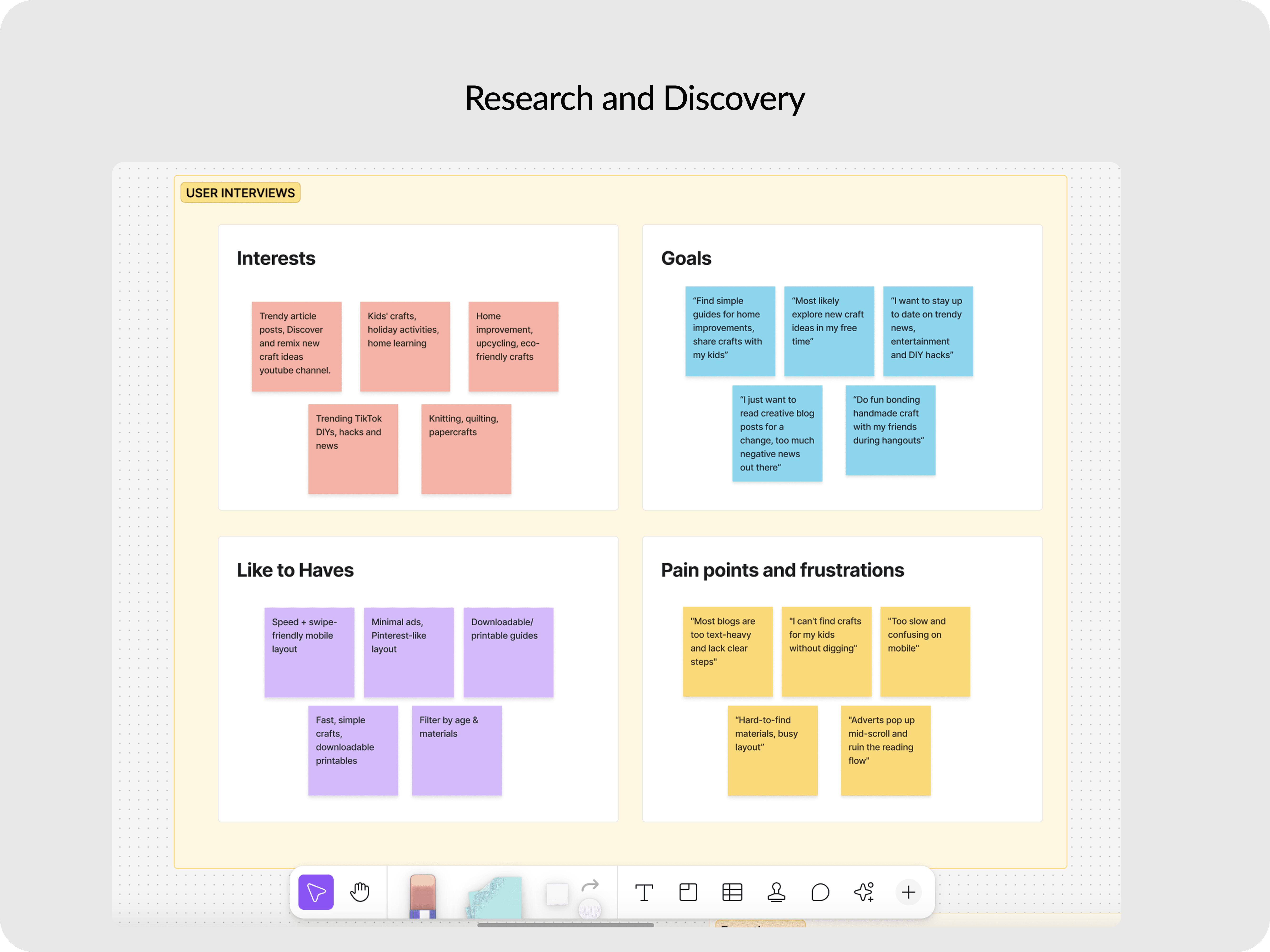
Design and Research Process
Design and Research Process
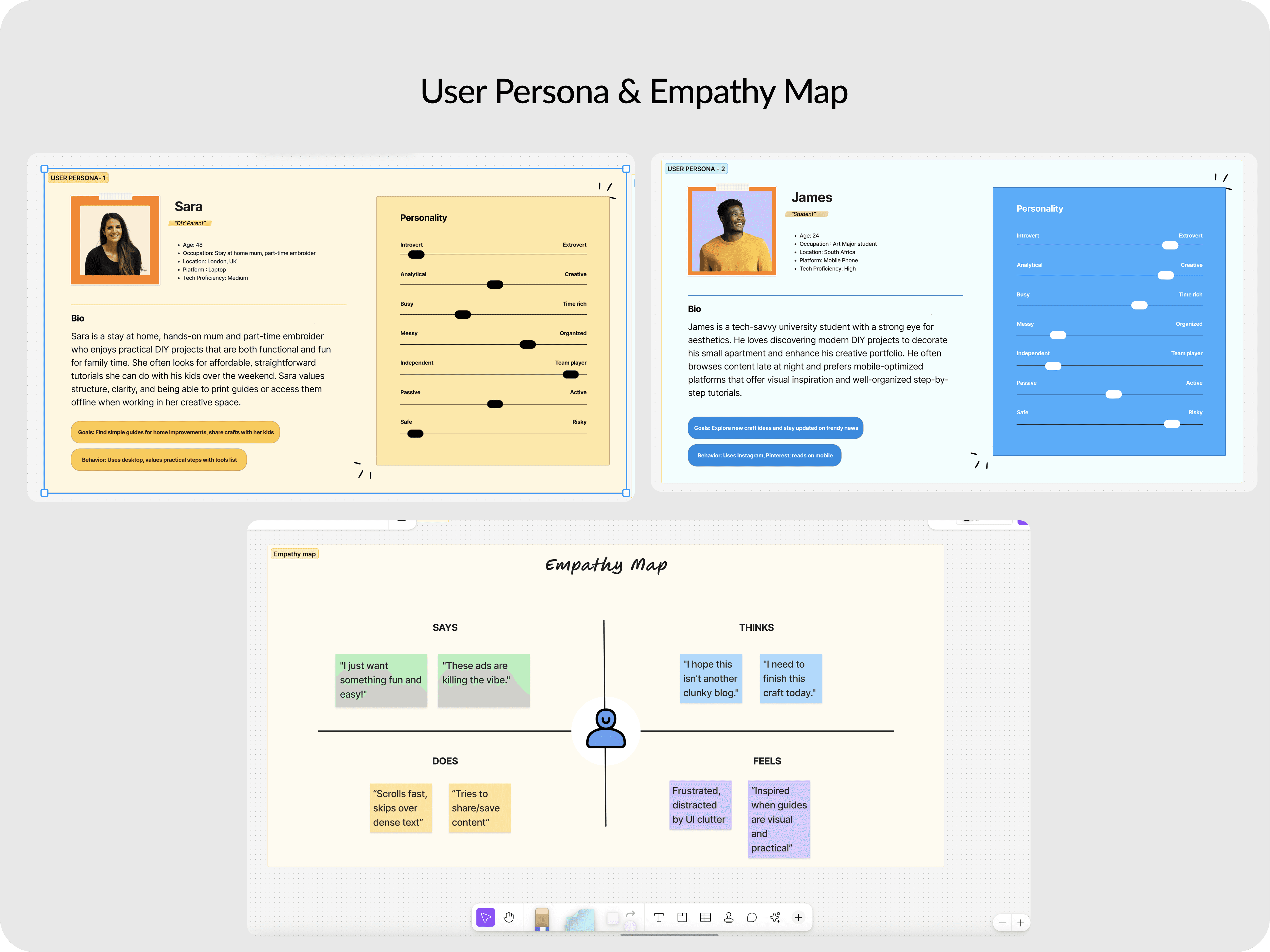
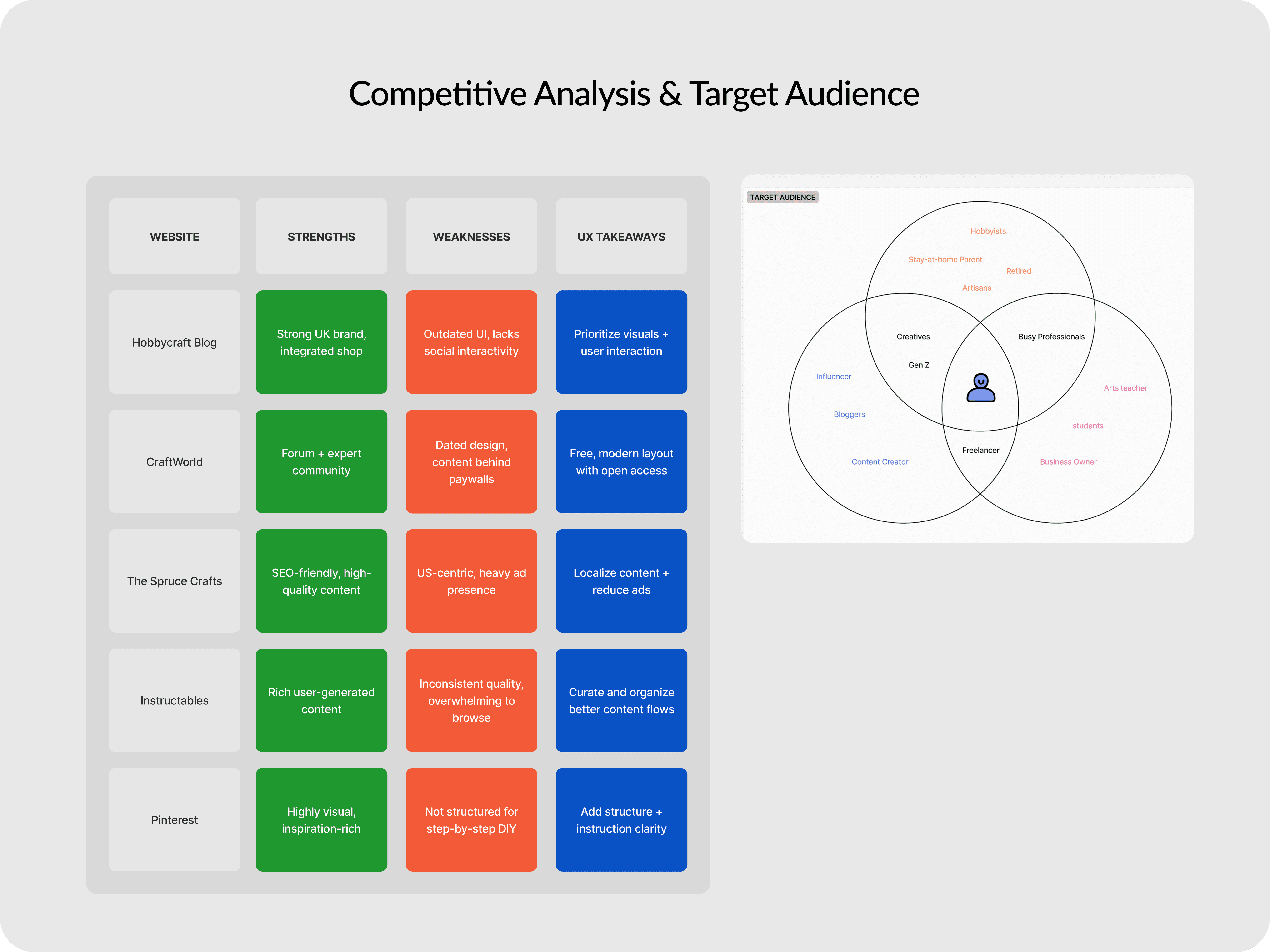
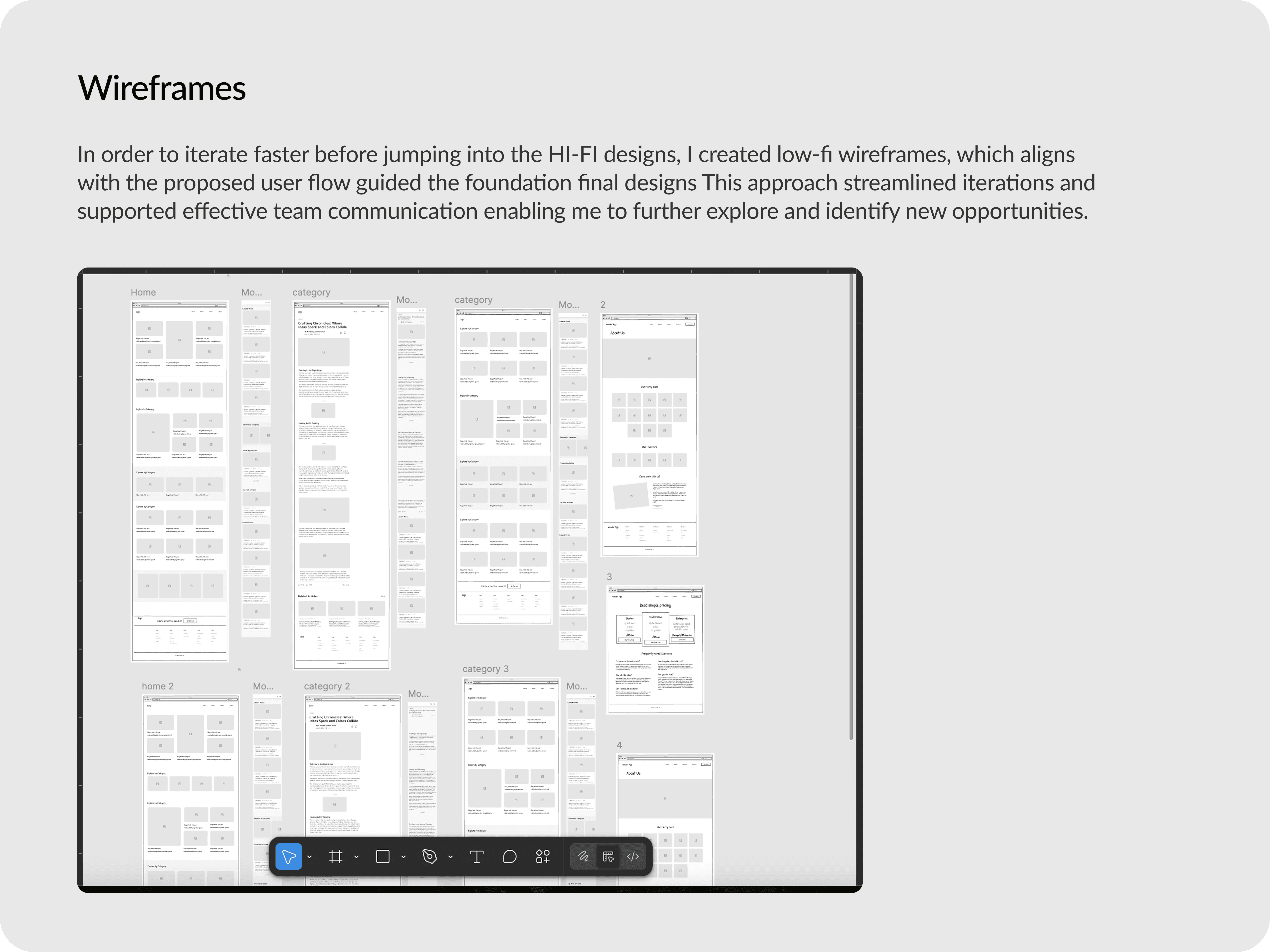
Once we had outlined the objectives and defined the overall scope of the project, we gathered enough requirements to kick off the first sprint. We started by conducting user research and competitive analysis to validate user pain points and brainstorm UX solutions with the rest of the team. I proceeded to mapping out the information architecture, personas, user flow and wireframes, focusing solely on the navigation, ease of use, before proceeding to Hi-Fi designs and usability testing.
Once we had outlined the objectives and defined the overall scope of the project, we gathered enough requirements to kick off the first sprint. We started by conducting user research and competitive analysis to validate user pain points and brainstorm UX solutions with the rest of the team. I proceeded to mapping out the information architecture, personas, user flow and wireframes, focusing solely on the navigation, ease of use, before proceeding to Hi-Fi designs and usability testing.
Usability Testing and Project Constraints : How we handled it
Usability Testing and Project Constraints :
How we handled it
A key challenge during the initial design draft was optimizing ad placements to maximize revenue without disrupting the user experience. We carefully studied and analyzed ad performance data, including impressions, clicks, and conversions.
Although removing ads entirely wasn’t an option, we refined their placement to focus on areas that actually generated revenue, rather than showing popups all over the site. Through this process, we settled on sticky side and bottom ads that don’t interrupt the reading flow, placing them on the most viewed pages where users spend the most time, like article pages. This approach helped increase revenue for the business.
In the end, it was a win-win solution that balanced user experience with business growth.
Before usability Testing : First Draft
Before usability Testing : First Draft
Outcome
Outcome
A few weeks after the official launch and without any marketing, we ran some internal tests and gathered initial results. The feedback shows about a 20% boost in user engagement. We successfully addressed the issue for 55% of users, while the remaining shared new insights that we'll be exploring in upcoming updates. We're still in the process…
A few weeks after the official launch and without any marketing, we ran some internal tests and gathered initial results. The feedback shows about a 20% boost in user engagement. We successfully addressed the issue for 55% of users, while the remaining shared new insights that we'll be exploring in upcoming updates. We're still in the process…
What I learned
What I learned
One of the most impactful phases of this redesign process was conducting usability testing before launch. By observing real users interact with the site prototype, I uncovered several key insights that I hadn’t fully considered during the design, particularly the placement and type of ads to be displayed.
One of the most impactful phases of this redesign process was conducting usability testing before launch. By observing real users interact with the site prototype, I uncovered several key insights that I hadn’t fully considered during the design, particularly the placement and type of ads to be displayed.